hey I heard you like sankey diagrams that show huge populations making terrible decisions
hey I heard you like sankey diagrams that show huge populations making terrible decisions
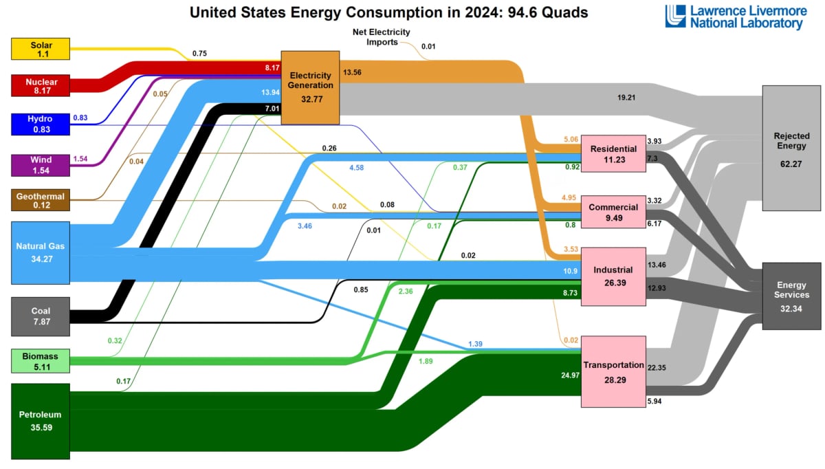
Alt Text: A very complicated Sankey diagram showing the usage of electricity in the United States. Or the left are sources of energy and on the right are consumers, so, for example, nuclear is on the left and residential is on the right. Petroleum dominates.